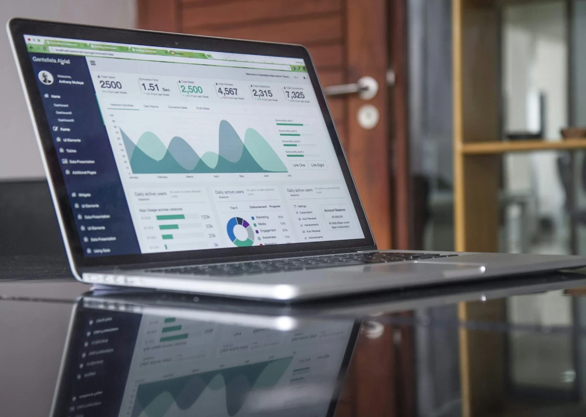
Dashboards play a crucial role in data visualization and business intelligence, transforming raw data into actionable insights through interactive and visually compelling presentations. They enable stakeholders to make informed decisions by providing a holistic view of key performance indicators, trends, and patterns.
Data visualization is a solid strategy that makes business-related information easily comprehensive, well-structured, and demonstrated. According to the Aberdeen Group, 82% of companies employing data visualization tools indicate an enhanced comprehension of their organizational data. Dashboard is a software the main goal of which is to represent the required data to drive business intelligence, ensure convenient metrics tracking, and elevate productivity. Such solutions provide intuitive interfaces that enable users to interpret complex data quickly and make relevant decisions.
Python, being the third most popular technology according to Statista, has come in wide use to implement sophisticated data processing software and custom dashboards. Its adoption for data science is powered by its solid range of libraries for data manipulation, computation, and visualization. For dashboard development, Python offers several frameworks that streamline the process of creating interactive and visually appealing interfaces. These frameworks leverage web technologies like HTML, CSS, and JavaScript to deliver dynamic dashboards that can integrate seamlessly with data pipelines and analytics tools.
In this article, we’ll explore the rich Python dashboard framework ecosystem, finding out key features and considerations to help you choose the best one for your specific case.
Table of Contents:
1. Dash by Plotly
Dash, developed by Plotly, is a powerful web dashboard framework for designing interactive web applications and dashboards. It smoothly integrates with Plotly, which is a widely employed Python dashboard library for creating dynamic graphs and charts, to provide an all-around solution for data visualization. Dash abstracts away much of the complexity related to web development, facilitating the creation of sophisticated dashboards using only Python code, without needing extensive knowledge of HTML, CSS, or JavaScript.
Key Features
- Customization. Offers a high degree of customization, enabling developers to create visually appealing and functionally rich dashboards;
- Interactivity. Supports interactive components like sliders, dropdowns, and buttons to make Python dashboards dynamic and highly responsive;
- Ease of use. Optimizes the implementation of web solutions with a straightforward syntax and extensive documentation;
Use Cases
Dash is a go-to choice for designing dashboards that require real-time data updates, such as monitoring financial metrics, visualizing IoT data, or creating interactive reports for business analytics. Its adoption ranges from industries like finance to healthcare, and it is being used for applications that benefit from smooth data visualization and interactivity. Dash may come as an excellent option for those seeking to design interactive, data-driven web applications with minimal tech hustle and bustle. Besides, its capabilities align perfectly with the best BI dashboard practices, such as interactive data exploration, real-time data updates, and user-friendly interfaces.
Pros:
- Provides a solid range of prebuilt, interactive components;
- Easy to learn and adapt for Python software engineers;
- Profound community support and ongoing updates;
Cons:
- Performance may lag with very large datasets or highly complex software.
- Limited customization compared to full-fledged web development frameworks.
2. Plotly (Standalone)
Plotly, when used autonomously, is a strong Python library for dashboard development and building interactive and visually appealing graphs and dashboards. As a standalone tool, Plotly is the optimal choice for providing in-depth, high-quality visualizations that are swiftly customizable and dynamic. It is perfect for applications that demand rich graphical representations without the complexity of a full dashboard framework like Dash.
Key Features
- Interactivity. Allows users to interact with charts by zooming, panning, and hovering to unfold detailed data points, taking data exploration to the next level;
- Rich visualizations. Equips technicians with a broad range of chart types, covering 3D plots, heatmaps, and choropleths, allowing fully-fledged data storytelling;
- Customization. Extensive customization options enable fine-tuning of almost every aspect of the graphs, starting with colors and labels and ending with more complex layout adjustments.
Use Cases
Separately performing Plotly is perfect for applications that require high-quality interactive visualizations embedded within web pages or reports. It’s particularly great in data analysis, scientific research, and business intelligence, where detailed, exploratory graphs are essential.
Pros:
- Straightforward to integrate with web applications and reports;
- Provides a high level of interactivity and detailed visual representation;
- No need for extensive setup or dependencies beyond the Plotly library itself.
Cons:
- Restricted to visualization without built-in data handling or backend integration.
- Lacks the dashboard-specific functionalities like layout management;
- May require more effort to create cohesive multi-chart dashboards compared to comprehensive frameworks.
3. Streamlit
Streamlit is a solid Python web dashboard framework designed to make the creation of interactive web applications for data visualization and machine learning more straightforward. It is often used in dashboard development services to ensure rapid prototyping capabilities, allowing IT experts to create and deploy sophisticated applications with minimal code. Streamlit offers a declarative approach so that tech experts can transform data scripts into functional products almost instantaneously.
Key Features
Streamlit has excellent features for quick and efficient dashboard development:
- Simple syntax. Uses Pythonic commands that are intuitive and easy to write, cutting down the complexities for newbies.
- Auto-reloading. Automatically updates the software in real-time as you modify the underlying code, streamlining the development flow;
- Wide widget support. Provides a variety of built-in widgets, for instance, sliders, buttons, and text inputs, to facilitate seamless user interaction without extensive frontend development specialization.
Use Cases
The Streamlit web dashboard framework demonstrates its power for cases requiring swift prototyping and accelerated iteration. It is used for quick data investigation, allowing data scientists to explore and visualize datasets interactively. Streamlit also facilitates the display and tuning of machine learning models so their performance becomes easier to modify and adjust parameters in a dynamic, user-friendly environment. It helps create interactive dashboards quickly and with minimal effort.
Pros:
- Intuitive and straightforward API;
- Rapid creation and deployment;
- No need for vast UI expertise;
Cons:
- Fewer customization opportunities in contrast to traditional web frameworks;
- The operation may experience delays for highly complex software.
Enhance Your Dashboards’ Potential
Explore the benefits of custom dashboard development and learn how tailored solutions can elevate your data visualization and decision-making processes.
4. Matplotlib
Matplotlib is one of the oldest and most widely used best Python dashboard libraries for data visualization. Introduced in 2003, it concentrates on providing a versatile and comprehensive plotting framework that can design static, animated, and interactive visualizations. Matplotlib is well-known for its ability to generate publication-quality graphs and its rich customization options, which makes it a frequent choice for data scientists and researchers. In case you’re interested in how to develop a dashboard app with Python, this framework is essential for you to be familiar with.
Key Features
- Integration. Works seamlessly with other Python libraries such as NumPy, pandas, and SciPy, ensuring the smooth integration of data analysis workflows;
- Customization. Allows to create tailored plots and bespoke visualization experiences;
- Vast number of plot types. Supports a variety of plots covering line charts, scatter plots, bar charts, histograms, pie charts, and more;
- Interactive plots. While primarily focused on static plots, it also supports interactivity through tools like Matplotlib widgets and integration with Jupyter notebooks.
Use Cases
Matplotlib excels in creating detailed, static visualizations for reports, academic publications, and presentations where precision and clarity are paramount. It is also ideal for exploratory data analysis and quick visualization of data trends and patterns.
Pros
- Robust for creating detailed, high-quality visual representations;
- Highly customizable, with vast options for tailoring visualizations to specific needs;
- Supported by comprehensive documentation and a large community for assistance;
Cons
- Can be cumbersome to use for interactive or real-time visualizations;
- Requires more time and effort to learn compared to newer, more user-friendly libraries.
5. Panel by Holoviz
Panel, developed by Holoviz, is a robust and flexible Python framework applied for the creation of complex, high-performance dashboards and data applications. This is a solid option for the integration of various plotting libraries, such as Bokeh, Matplotlib, and Plotly, that assist users in creating sophisticated and interactive data representations. Panel has a robust architecture that enables it to handle large datasets and complex data workflows flawlessly. If you’re planning some advanced data visualization projects, Panel is the right option.
Key Features
Panel is an outstanding dashboard development framework due to its versatility and the other valuable features it introduces:
- HTML and markdown support. Seamlessly incorporates HTML, Markdown, and interactive elements;
- Custom layouts and dashboards. Allows creation of personalized layouts and dashboards;
- Wide visualization support. Embeds various visualization tools and enhances user interaction with dynamic widgets;
- Versatile integration. Seamlessly integrates with other Python libraries;
- Server-side applications. Supports real-time data streaming and updates.
Use Cases
Panel is a web dashboard framework that is suited for the development of large-scale data visualization projects, particularly those requiring the integration of numerous data sources and highly sophisticated visual analytics. It is used in sectors like finance, healthcare, and research, where high-performance, interactive dashboards take the centric role for data-driven decision-making and analysis.
Pros:
- Effective for handling of large datasets and real-time data updates;
- Flexible, with vast support for diverse plotting libraries and custom layouts;
- Ensures seamless integration with other Python dashboard frameworks, tools, and libraries;
Cons:
- More complex in learning in contrast to more straightforward frameworks like Streamlit;
- Requires significant computational resources for very large data sets.
6. Bokeh
Python-based library Bokeh is created to create dynamic and high-performance visualizations for web browsers. It effectively transforms complex datasets into easy-to-grasp, interactive visual demonstrations. Bokeh’s primary strength lies in its ability to produce detailed visualizations that can be easily modified and implemented into web applications.
Key Features
Bokeh ensures tech engineers with the following range of data visualization features:
- Server support. Allows for the creation of dynamic and interactive web applications with Bokeh Server, enabling users to manipulate data on the fly;
- Interactive tools. Covers various interactive tools that elevate user engagement and data exploration;
- Real-time streaming. Supports real-time data updates for dashboards that need to represent live data;
- Integration. Seamlessly integrates with Python libraries, boosting data analysis workflows even more.
Use Cases
Bokeh is highly effective in scenarios necessitating real-time data visualization, such as financial trading platforms, live monitoring systems, and interactive data research tools for cast datasets.
Pros:
- Smoothly integrates with web frameworks and supports embedding in HTML;
- Delivers a range of interactive features that enhance data visualization;
- Versatile and suitable for a wide range of visualization needs, from basic to complex;
Cons:
- May have a steeper learning curve for beginners due to its extensive features;
- Can be slower for very large datasets compared to some other visualization tools.
7. Voila
Voila is a powerful tool that converts Jupyter notebooks into standalone, interactive dashboards. It allows users to transform their notebooks, which are typically used for data exploration and analysis, into professional-looking dashboards that can be shared with others without requiring any changes to the underlying notebook code. Voila strips out the code cells and only displays the output, providing a clean, interactive user experience.
Key Features
Voila’s core capabilities include seamless integration with Jupyter notebooks, interactive widgets, and more:
- Supports interactive widgets, using ipywidgets for dynamic content without a web server or JavaScript;
- Ensures seamless Jupyter integration, transforms existing Jupyter notebooks into interactive dashboards;
- Allows the deployment of dashboards on the web or cloud services like Binder for collaboration and accessibility.
Use Cases
Voila comes in use for cases where data scientists or analysts need to present their insights to non-technical stakeholders. It robustly assists in showcasing the results of data analysis or machine learning models, offering an interactive manner to explore data findings without exposing the complexity of the underlying code.
Pros:
- Eliminates the need for additional front-end development;
- Easy to use, especially for those already familiar with Jupyter;
- Supports real-time interactivity through widgets;
Cons:
- Not suitable for highly complex or large-scale dashboard applications;
- Decreased customization options compared to other dashboard frameworks;
- Dependency on the Jupyter ecosystem can be a constraint for non-notebook users.
Tailored Dashboard Solutions for You
Discover our professional dashboard development services designed to turn your data into actionable insights and drive your business forward.
Real-World Applications of Python Dashboard Frameworks
Some businesses have already adopted Python dashboard frameworks, effectively visualizing and interacting with data. Let’s now consider some real-world cases demonstrating the potential of Dash and Streamlit in action as an example.
The Stable’s Data Scalability Solution with Streamlit
The Stable, a commerce agency specializing in data-driven solutions, faced a challenge in scaling its analytics work. Their team’s algorithms and insights were locked in Jupyter notebooks and Python scripts, resulting in bottlenecks in sharing and scaling their work across clients. Building interactive applications to democratize this data required full-stack development expertise and time-consuming resources, which were beyond the team’s capacity.
Streamlit was selected as the solution after a team member discovered its potential during a monthly hack day. It offers simplicity, a Python-first approach, and the ability to quickly transform scripts into interactive web apps, flawlessly suiting the Stable case.
The adoption of Streamlit has reduced the time to deploy data applications from weeks to just hours, allowing clients to access insights interactively and independently. Within three months, Streamlit applications were scaling across the company, enabling faster decision-making, boosting client satisfaction, and ensuring the business performance delivers maximum impact.
Situational Awareness Application for Cities Using Dash
During the COVID-19 pandemic, cities urgently needed tools to monitor social distancing and manage gathering sizes to prevent outbreaks. Existing solutions were either too generic or lacked the ability to process and visualize real-time data effectively. City officials required a centralized platform that could provide actionable insights from multiple data streams to ensure public safety and allocate resources efficiently.
Within this case, Plotly Dash was chosen to develop a situational awareness application as it can handle real-time data and optimize the creation of interactive visualizations. It also facilitates the smooth integration of various data sources, covering social media and mobility data.
As an outcome, Dash has become the foundational tech stack for the application. The product has enabled city officials to monitor potential hotspots and gatherings, facilitating timely interventions and resource allocation to maintain public health measures.
How to develop a dashboard in Python
Grasping the strengths of each Python dashboard framework becomes much easier when paired with hands-on examples. Let’s cover some simple, functional code snippets for each framework, demonstrating how to create basic dashboards or visualizations to get you started.
Dash
Dash allows you to create interactive dashboards entirely in Python. Here’s a plain instance that creates a dashboard with a dropdown menu and a graph:
import dash
from dash import dcc, html
from dash.dependencies import Input, Output
import plotly.express as px
import pandas as pd

app = dash.Dash(__name__)
df = px.data.gapminder()

app.layout = html.Div([
    dcc.Dropdown(
        id='dropdown',
        options=[{'label': country, 'value': country} for country in df['country'].unique()],
        value='United States'
    ),
    dcc.Graph(id='graph')
])

@app.callback(
    Output('graph', 'figure'),
    Input('dropdown', 'value')
)
def update_graph(selected_country):
    filtered_df = df[df['country'] == selected_country]
    return px.line(filtered_df, x='year', y='gdpPercap', title=f'{selected_country} GDP Over Time')

if __name__ == '__main__':
    app.run_server(debug=True)
Plotly (Standalone)
Plotly is a library for creating interactive visualizations, so let’s do a quick and engaging scatter plot:
import plotly.express as px

df = px.data.iris()
fig = px.scatter(df, x='sepal_width', y='sepal_length', color='species', title='Iris Dataset Scatter Plot')
fig.show()
Streamlit
Streamlit optimizes building and deploying interactive applications. Below is the illustration on how to display a line chart:
import streamlit as st
import pandas as pd
import numpy as np

st.title("Simple Line Chart with Streamlit")

data = pd.DataFrame({
    'x': np.arange(1, 11),
    'y': np.random.randint(1, 100, 10)
})

st.line_chart(data.set_index('x'))
Run this code with streamlit run script_name.py.
Matplotlib
With Matplotlib, which suits static visualizations, we’ll create a simple line chart example:
import matplotlib.pyplot as plt

x = [1, 2, 3, 4, 5]
y = [2, 4, 6, 8, 10]

plt.plot(x, y, marker='o')
plt.title("Simple Line Chart")
plt.xlabel("X-axis")
plt.ylabel("Y-axis")
plt.grid(True)
plt.show()
Panel by Holoviz
Panel is used for creating powerful dashboards, so let’s display a slider that updates a plot:
import panel as pn
import numpy as np
import matplotlib.pyplot as plt

pn.extension()

def plot_data(n):
    x = np.linspace(0, 10, 100)
    y = np.sin(x * n)
    plt.figure()
    plt.plot(x, y)
    plt.title(f"Sine Wave with Frequency {n}")
    return plt.gcf()

slider = pn.widgets.FloatSlider(name="Frequency", start=0.1, end=10, step=0.1, value=1)
dashboard = pn.Column(slider, pn.bind(plot_data, slider))
dashboard.servable()
Run this using panel serve script_name.py.
Bokeh
Bokeh is ideal for creating interactive plots. The code below offers a simple example with a slider to adjust data:
from bokeh.plotting import figure, curdoc
from bokeh.models import Slider
from bokeh.layouts import column

plot = figure(title="Interactive Line Plot", width=600, height=400)
line = plot.line(x=[], y=[], line_width=2)

slider = Slider(start=1, end=10, value=1, step=1, title="Multiplier")

def update_data(attr, old, new):
    x = range(10)
    y = [i * slider.value for i in x]
    line.data_source.data = dict(x=x, y=y)

slider.on_change('value', update_data)
layout = column(slider, plot)
curdoc().add_root(layout)
Run this code using bokeh serve –show script_name.py.
Voila
Voila turns Jupyter notebooks into dashboards. Save this example as a .ipynb file, then run it with voila script_name.ipynb:
import ipywidgets as widgets
from IPython.display import display

slider = widgets.FloatSlider(description="Multiplier", min=1, max=10, step=0.1)
output = widgets.Output()

def update_plot(change):
    with output:
        output.clear_output(wait=True)
        x = range(10)
        y = [i * slider.value for i in x]
        plt.plot(x, y)
        plt.title(f"Multiplier: {slider.value}")
        plt.show()
slider.observe(update_plot, names="value")
display(slider, output)
Framework Comparison Table
Choosing the right Python dashboard framework depends on your specific needs, such as interactivity, customization, or ease of use. To simplify your decision, use the following comparison table defining the core features, use cases, and strengths of each framework.
| Feature/framework | Dash | Plotly (Standalone) | Streamlit | Matplotlib | Panel | Bokeh | Voila |
| Primary use | Interactive dashboards and web apps | Interactive graphs and charts | Rapid prototyping of data apps | Static and publication-quality plots | High-performance, customizable dashboards | Real-time, interactive visualizations | Convert Jupyter notebooks to dashboards |
| Ease of use | Moderate | Easy | Easy | Moderate | Moderate to Advanced | Moderate | Easy |
| Customization | High | High | Limited | Very High | High | High | Limited |
| Real-time data support | Yes | No | Limited | Limited | Yes | Yes | Yes |
| Interactivity | High | High | Moderate | Low | High | High | Moderate |
| Integration with libraries | Good (e.g., Plotly, pandas) | Moderate | Moderate | Excellent (e.g., NumPy, pandas) | Excellent (e.g., Bokeh, Matplotlib) | Good | Good |
| Performance with large datasets | Moderate | Moderate | Limited | Good | Excellent | Good | Limited |
| Target audience | Data scientists, BI developers | Analysts, data scientists | Data scientists, ML practitioners | Researchers, academics | Advanced developers, domain experts | Developers, analysts | Data scientists, educators |
| Key strengths | Interactive, easy to integrate | High-quality visualizations | Rapid deployment | Versatility in static visuals | Versatile and integrates many tools | Real-time interactivity and tools | Simplifies sharing Jupyter outputs |
| Key weaknesses | Can be slower for large datasets | Limited layout and dashboard features | Limited customization | Steeper learning curve | Steep learning curve | Steep learning curve | Limited functionality compared to full frameworks |
| Best use cases | BI dashboards, real-time monitoring | Detailed exploratory graphs | Quick prototypes, ML models | Static plots for publications | Complex and large-scale dashboards | Real-time monitoring, IoT apps | Sharing analysis with non-technical users |
| Learning curve | Moderate | Low | Low | Moderate | High | High | Low |
Conclusion
All in all, we’ve explored several powerful Python frameworks for dashboard development, each offering unique strengths and capabilities.
- Dash stands out for its web application framework capabilities;
- Matplotlib is excellent for static plotting;
- Streamlit provides simplicity for creating interactive apps;
- Panel is applied for interactive, high-performance dashboards
- Bokeh provides robust tools for complex visualizations;
- Plotly offers versatility with its interactive plots;
- Voila converts Jupyter notebooks.
When choosing the best framework for dashboard development, consider project requirements such as interactivity, complexity, and deployment needs. Dashboards built with Python bring strong benefits from its vast ecosystem of data science libraries and strong community support.
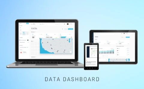
Spontivly
Spontivly now supports 120+ integrations, enhancing workflow efficiency & providing actionable insights across industries, improving operations.
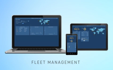
Spark
The Spark app converts operational data into clear fuel insights, empowering fleet managers to enhance efficiency & reduce environmental impact.
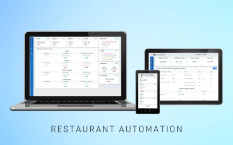
Restaurant Management
Implemented a cloud-based management system for restaurants, centralizing data from POS & labor systems to enhance efficiency and profitability.
Python’s adaptability and extensive toolset empower users to create engaging and visually appealing solutions and intuitive dashboards that effectively communicate insights from data, enhancing decision-making processes across various industries. If you’re struggling to choose the best Python dashboard framework for your project, PLANEKS experts are at your disposal. Schedule a call with our representatives and get a professional consultation on the tech stack that will make your software top-quality and flawless.

