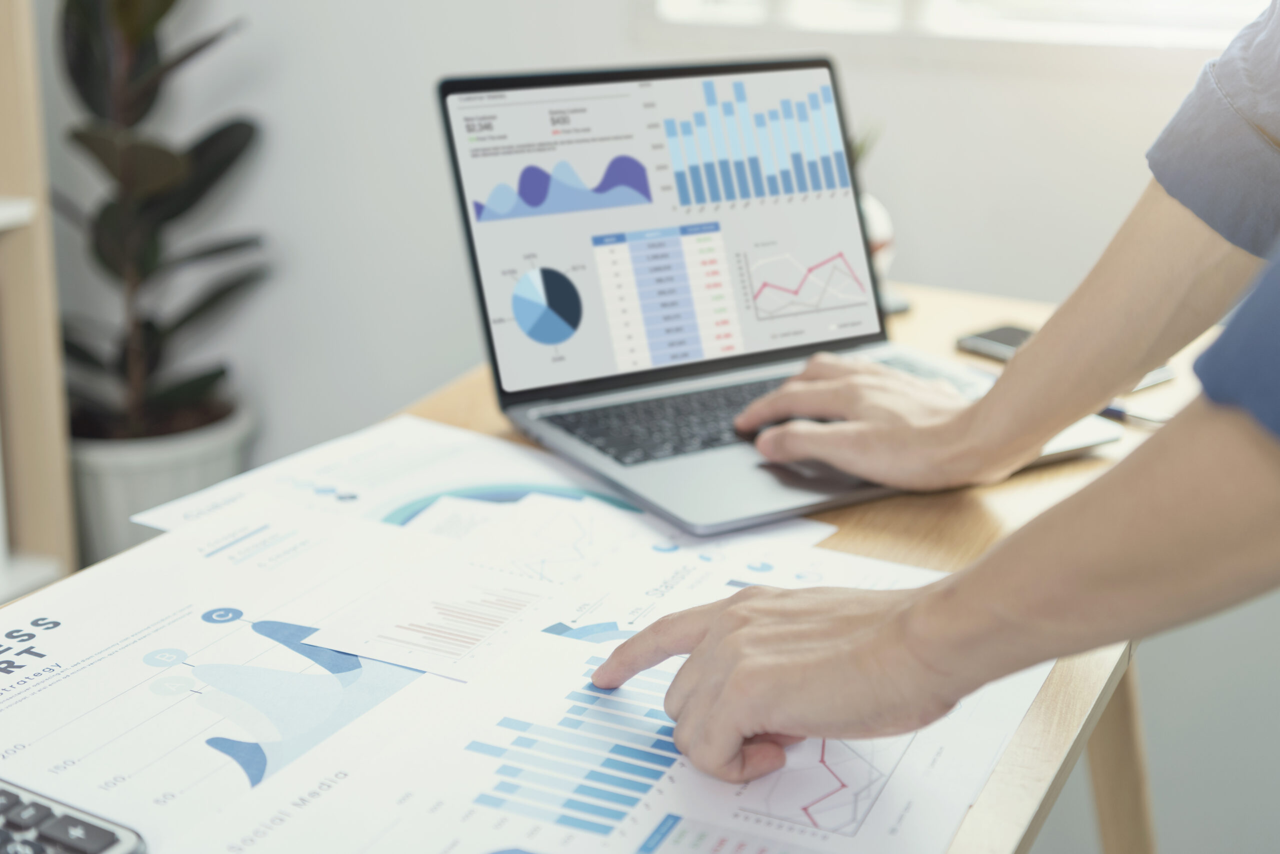
The most solid way to turn the collected information into an asset is to visualize the gathered data via the intuitive dashboard platform for your company. A dashboard application is a platform that provides an interactive digital analytics panel. It’s a graphical interface that grasps the story the data is telling. All vital metrics, goals, or process indicators are located on a single screen. You can use these indicators to identify and analyze trends and changes or make vital decisions related to your project in business. Businesses across a variety of industries like finance, retail, tourism, logistics, and supply chain use dashboards to analyze performance data. To create a helpful dashboard, developers should use a suitable tech stack. Python is a perfect programming language to create a full-fledged web-based platform that allows you to represent real-time data visually.
Let’s reveal how to create a dashboard using Python and renovate powerful, but boring classic spreadsheets, opening up a larger view of collected data.
Table of Contents:
Dashboard development process
The key stages to building a dashboard web application may insignificantly vary depending on the peculiarities of your business and project. The typical ones, however, are the same for most projects. We’ll reveal more details concerning each fundamental stage to describe how to build a dashboard web application.
Define metrics (ideation)
The primary step you need to take to build a dashboard web application is to highlight the most important metrics that you would like to track and present visually within your future application. A traditional illustration of such metrics comprises turnaround time, manufacturing time, generating leads, customers, conversion rate optimization, costs, expenses, client satisfaction, the number of defects, etc. These metrics measure the people’s performance in the operations function and can help identify where the discrepancy has its roots if it has risen.
Choose chart types
Defining the chart types, which will be the most useful in your case, is the best way to get the maximal use of the dashboard. Charts can show outliers and valuable details that were hidden before, and when opting for the unsuitable type of dashboard visual representation, they may still remain unrevealed. To design a custom dashboard, you may consider different interactive widgets:
Area
Area charts are useful in representing multidimensional information in a single section. Such a type can highlight the value of modification within a specific time and define the tendency. Among the use cases, we can face such graphs in marketing analysis
Bar
Bar charts will be a brilliant choice for separating data or revealing the relation between its part to a whole. You can apply a bar chart to demonstrate the details being compared or to generalize it easily. The most typical use case can be faced in e-commerce. To illustrate, bar charts are applied to compare the number of generated leads from different social networking platforms or the obtained revenue in various time periods.
Funnel
Funnel charts are usually used for streamlining. In particular, they mainly show which steps primarily impact setbacks. Funnel charts can clearly demonstrate progress within the set time periods. One practical example can be tracking the flow of orders from their placing to delivery.
Line
Line graphs connect data along an interval scale that will demonstrate the indicators’ modification tendency at equal intervals of time. In most cases, the y-axis demonstrates the dependent value, and the x-axis defines the independent variable. Such charts are used in the healthcare industry to demonstrate the dynamic tendencies of patients’ medical conditions (e.g., temperature, weight, blood pressure, heart rate, and other crucial indicators.)
Pie
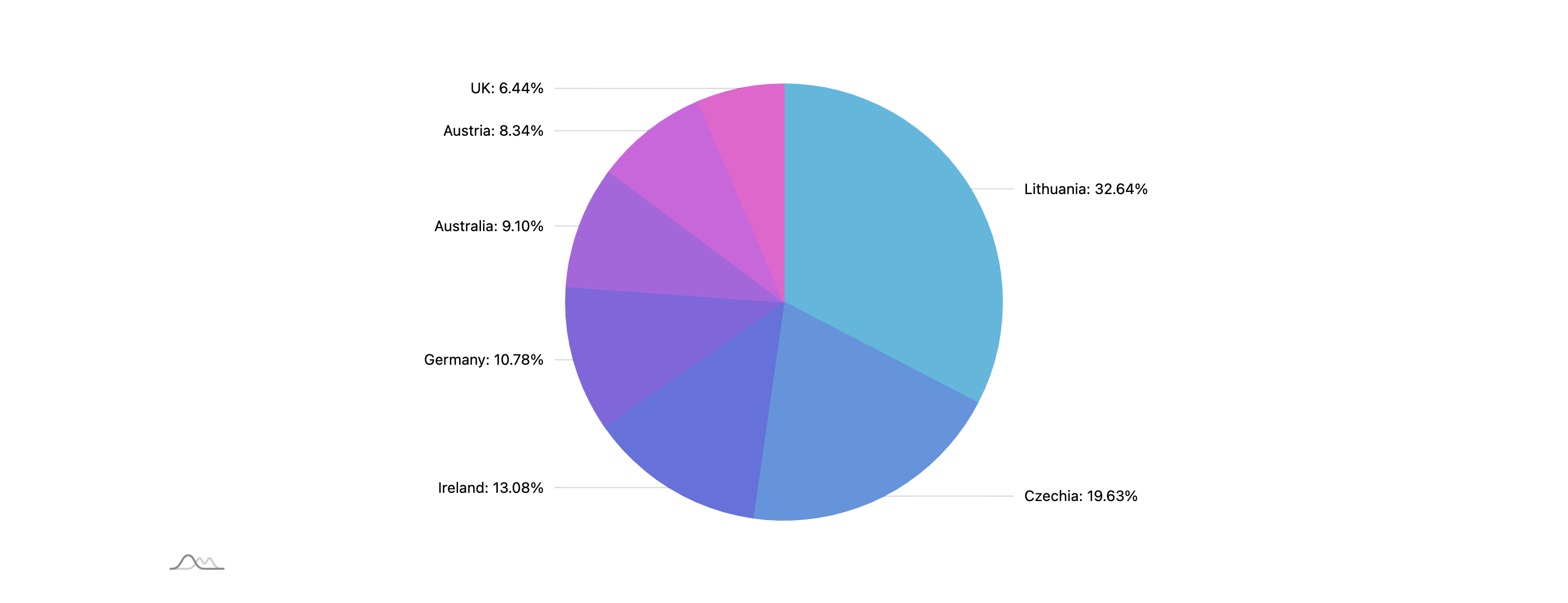
Pie charts are also highly useful for showing the data correlation. This type of chart can be efficient in tracking the involvement of data elements in the percentage of a whole. This type is ideal for financial management and can perfectly display expenses and savings within businesses.
Scatter plot
Scatter plots help businesses detect the interconnection between two values, often quantities. It is commonly used when a variable exists that is below the control of the experimenter to demonstrate how much one element is impacted by another. In practice, restaurant and cafe businesses opt for this type to track the sales of various menu positions.

Bullet graph
Bullet graphs can be useful to compare an initial value to one or more values within the frameworks of qualitative performance ranges. It’s a great way to track such indicators as the customer satisfaction rate, product usage, as well as employees’ efficiency and performance.

Single value
A separate number chart is excellent in emphasizing a specific data element as well as focusing on a significance like total revenue, progress, or conversion. With it, companies can track the average client retention rate, sales, and other useful metrics.

The selection of the appropriate types of graphs for your solution is a critical part of your requirements for the future product. Based on the initially gathered details, you are ready to move on to the following stages, essential within the software development life cycle. The product roadmap may be different across projects, yet, the steps we’ll describe, traditionally remain the same.
Define a tech stack
To build a dashboard with Python, you need to choose the right and high-quality set of technical tools in addition to the programming language itself. This is usually quite a complex process for a non-technical person. Therefore, we highly recommend contacting a competent software development vendor. An experienced partner will analyze the features and requirements of your business and select the appropriate tech stack for your request.
Create a design
Qualitative and intuitive UI/UX design is a crucial step to create a dashboard in Python. This phase defines the position of the application elements, modules, components, architecture, different interfaces, and data types that the platform processes. Depending on your requirements, a visual interface design is created in the form of an interactive prototype. Its development serves as a form of the project concept and idea validation.
Development
Implementation and configuration of the application’s functionality are some of the most important elements of the dashboard development process. Within this phase, software engineers at our Python development company power the metrics, create formulas and transform the data into charts of the future dashboard web app. The implementation of features occurs during this step, making the application perform its key objectives and functions, such as data transferring and visualization. As a result, the dashboard executes its initially set purposes and operates correctly, processing the information securely, and delivering qualitative performance.
Testing
Prior to deploying the project, you should make sure your dashboard app contains no errors. During the testing stage, a team of quality assurance engineers conducts numerous tests to verify the app’s performance. In case there are any operational concerns, the team of developers fixes them.
Deployment
The next step of how to create a dashboard using Python is launching a web application and making your product available for internal or public use. If you use Python to develop a dashboard for your team, you may go for the cloud environment. Such an infrastructure ensures excellent sustainability, secure data processing, mobility, low maintenance costs, and scalability.
Maintenance
Diving deeper into how to develop a dashboard application, it’s vital to carry out periodic app maintenance. It allows you to keep it on-demand and competitive as well as avoid obsolescence. This becomes possible due to:
-
- Updating functionality and continuous performance evaluation
- Upgrading of certain components, compliance with the required standards and the latest technologies, security checks
- Performance monitoring and observability possible with tools like Datadog and New Relic which help fully understand your Python-powered app and track performance metrics for further product enhancement
Features
Let’s outline the potential list of features you can implement into your dashboard app. The following range reflects the possible functionality, yet, the core elements are typical for most dashboard apps.
Filtering
Dashboard apps commonly show several graphs and charts on a single screen. Tracking the vital KPIs with the main hub allows you to quickly estimate the overall performance and react accordingly as soon as possible.
Yet, if you need to monitor a specific period of time, check the metrics of a particular company department, or track the delivery progress. A qualitative filtering system within the dashboards allows you to get the required data quickly. Choosing the required category, visual representation type, or time period, you can simply make modifications to data displayed throughout the graphs and charts.
Sorting
The data sorting feature performs the process that involves arranging the data into some meaningful order to make it easier to comprehend, analyze, and visualize. When working with research data, sorting is a traditional way applied for visualizing data in a form that makes it simpler to comprehend the information.
User role management
In order to give access to visual analytics to different departments, there are several roles that you can give to your users- administrator, who manages the permission access to the dashboard and controls the data available for each party. Apart from the administrating, the role-specific permission is given according to the department and the tasks the employee executes; With such a system, you can allow or restrict access to activities like creating a new chart, editing, commenting, and viewing the dashboards. According to the mentioned actions, permission access is provided to the users on different levels: for the author, editor, and reader respectively.
Real-time updates
The data represented in a user-friendly dashboard should be updated and renewed in real-time to stay relevant. Rapid data processing and extraction is a feature that delivers your data to the dashboard, keeping it in the most recent state.
Cross-device support
The cross-platform or multi-platform app is a type of software that is available on a diversity of operating systems or devices, also called platforms. This feature is integral to providing users with your app regardless of what gadget they run the platform with.
Animation
Animation and motion are considered a global trend in design, capturing the audience’s attention and delivering the best possible experience in app interactions. The charts and graphs your interface comprises may have small animations to improve the intuitiveness and the overall app interface quality.
Predictive analytics
Predictive analytics refers to a branch of enhanced information that provides forecasts concerning future results by applying historical data in conjunction with data mining techniques, Artificial Intelligence, and Machine Learning. You may implement this feature into your Python dashboard app to detect patterns in this data, as well as assess risks and opportunities.
Custom reports
Custom report types are those that you create and modify in the way you need. This feature allows you to design complex reports that go beyond the standard templates and chart types. You can choose the dimensions and metrics and select how to display them.
Transform Your Data Into Actionable Insights
Uncover hidden patterns and drive informed decisions with our custom Python dashboard solutions.
Technologies to use to design a dashboard platform
Dashboards require the usage of indispensable technologies and solutions that make them operable and efficient. The list below discloses them.
Data retrieval
The primary point of how to build a web-based dashboard is to determine the hubs to transfer the data. They may be both external (third-party platforms) and internal (business systems that already exist in your company’s environment)
API integration
To extract data from third-party systems and apps, you will need to integrate an API into your dashboard platform. This enables your app to interact with others and transfer the required data for further visualization.
Databases
Syncing an internal database with the required details you would like to extract and transform into charts and visual analytics is also integral. Regular syncing helps keep the data relevant and up-to-date. As a result, you make maximal use of the stored data by analyzing and visualizing it with your web app.
Files
Support of CSV, XLS, Google Sheets, and the other essential types of files is required to get the data contained in the documents. To be able to conduct data retrieving from such types of docs to your dashboard app, you need to implement the export, import, and parsing of such files.
Manual data entry
You should design a user interface to enter data with no transfers from repositories or other external systems. Its key purpose is to let the users input the required data manually- numeric, text, dropdown, checkbox, and date formats.
Visualization
Charting libraries are designed to transform your data and represent it visually. They help demonstrate the extracted information within the range of chart types. Here are some solid charting libraries to make use of:
-
- Chart.js. Chart.js is a free, open-source JavaScript library for data visualization, which supports eight chart types: bar, line, area, pie, bubble, radar, polar, and scatter.
- D3.js. It is a JavaScript library for producing dynamic, interactive data visualizations in web browsers.
- AmCharts. AmCharts is a set of programming libraries and tools for all your data visualization needs on the web.
- Google Charts. This is an interactive web service that creates graphical charts from user-input information.
- HighCharts. It’s a pure JavaScript library, the purpose of which is to implement interactive charting capability in web apps.
- Python visualization libraries. They include Matplotlib- a comprehensive library for creating static, animated, and interactive visualizations in Python. Another library is called Plotly, a popular open-source graphing library featuring maps, financial charts, scientific graphs, and more. Dash is another open-source framework for building data visualization interfaces.
Backend
-
- Python. This programming language is perfect for designing sophisticated dashboard web applications due to the wide range of compatible web frameworks and libraries it introduces. Apart from this, in case you use Python to develop a dashboard and apply its libraries for data visualization, you can significantly decrease costs as well as time-to-market.
- Django. The Python-based Django framework sticks to the “Batteries included” principle and provides almost everything developers may need for full usability. As all the required parts are included in one utter “product,” the final app works smoothly and delivers in-depth and fresh documentation due to Django-based development.
- Flask. Flask is a powerful Python-based web framework that delivers maximal compatibility with a great diversity of services for information visual demonstration. The framework enables Flask developers to design a highly customizable dashboard platform and supports Python-based libraries for data visualization.
- BI software. Business intelligence instruments are types of application software that assemble and operate vast unstructured data loads from internal and external sources, such as books, journals, documents, health records, images, files, email, video, and other business sources.
However, it is vital to remember that each project requires an individual approach, so the mentioned tech stack is variable and may change to reflect your demands.
Creating a Python-based web application for dashboards is a complex process that requires solid expertise in a correct software development lifecycle completion. PLANEKS is a dashboard development company that will become your credible technical partner. Our experienced team of software engineers will architect a bespoken product that will efficiently transform your data and deliver deepened visual representation.
Are you eager to start making the maximal use of the gathered business data and bring new opportunities to your business? Start the Python-based dashboard app with us and look at the collected data from the other side. Obtain new insights with a robust data-driven solution to have the clearest overview of your internal business processes. Share your requirements with PLANEKS, and we’ll implement every feature you would like to have in your dashboard solution.
Spontivly
We optimized Spontivly with 120 integrations, improving data dashboards & performance for more than 70 organizations, making operations smoother.
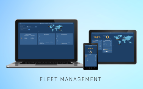
Spark
Spark software empowers fleet operators with real-time fuel data, efficiency rankings, driving smarter decisions, reducing costs and environmental impact.
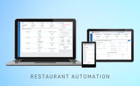
Restaurant Management
Comprehensive restaurant management tool that integrates multiple data sources, enhancing profitability through improved operational insights.
FAQ
How long does it take to develop a dashboard with Python?
The number of hours required to implement a Python dashboard application depends on the functionality complexity of your dashboard platform, so it requires an individual estimate. In our vast experience, we at PLANEKS have delivered the MVP (Minimum Viable Product) dashboard comprising a basic functionality within a month. However, we’ve also successfully accomplished projects that have been developing and enhancing for years, helping our partners transform granular data into conscious and comprehensive business decisions, optimizing their workflow.
How much does it cost to develop a dashboard with Python?
On average, the cost of a full-fledged dashboard app that works with a diversity of sources as well as subsequently processes and visualizes the extracted data, varies from $30,000 to $50,000. To get a more precise number concerning your case, we highly recommend applying to a competent software development vendor.
Does PLANEKS develop data-driven dashboards?
Our PLANEKS team has great competence in implementing qualitative Python-based dashboard applications across a range of sought-after industries like e-commerce, MedTech, restaurant management, enterprise fleet management, and many others. You can get acquainted with our portfolio on our site. Feel free to contact us and negotiate the details of your project

