Data is the primary element for relevant business decision-making. The Global survey on data-driven decision-making in businesses proves the growing reliance on data: 50% of all business decisions are specifically based on data analysis, and 62% of companies aim to treat it as an asset in the future. Meanwhile, 34% use data to identify new opportunities. In these terms, handy and straightforward data demonstration and representation are a must. Dashboard software solutions efficiently transform raw data into actionable insights, assisting businesses to make informed decisions.
This guide aims to provide a clear, step-by-step process for developing effective dashboards, ensuring they meet business requirements and drive strategic goals. Let’s explore 8 essential steps and optimize the development flow, from defining objectives and studying your audience to selecting the right tools and ensuring data accuracy.
Table of Contents:
Define Your Objectives
Setting your goals and forming appropriate KPIs and metrics from the outset are foundational steps to ensure that your dashboard provides meaningful insights, supports strategic decision-making, and drives business success.
Identify Goals
Dashboard development starts by clearly defining your objectives. To ensure your dashboard remains clear and effective for decision-making, it is essential to define its purpose initially. Start by identifying the primary goal of the dashboard. Are you aiming to track overall business performance across departments, monitor specific projects, analyze customer behavior, or identify sales trends? Outlining the specific questions you need answers to will help you gain further strategic direction and focus on your dashboard. Reach out to stakeholders and gather their input to ensure that the dashboard will cater to the exact requirements of its primary users.
Set KPIs and Metrics
Having a full understanding of your goals, you can determine the key performance indicators (KPIs) and metrics that will help you measure progress toward these objectives. KPIs are the critical aspects that provide a snapshot of how well your business is operating against its strategic goals. In case you opt for credible dashboard development services, your IT vendor can optimize this process by not only taking over the initial preparation steps but also ensure seamless and qualitative software implementation.
Let’s take a look at some widely-used KPI examples for various business departments and objectives:
Selecting the right KPIs requires more than just choosing the most obvious metrics. It’s essential to ensure that these KPIs directly reflect your business objectives and can provide actionable insights. Put in practice, a metric such as “website traffic” might be relevant for an e-commerce business striving to increase online sales, but it might be less relevant for a manufacturing company focusing on production efficiency.
Moreover, it’s integral to establish benchmarks or targets for each KPI. They will serve as a reference point, allowing you to quickly assess whether you are on track to meet your goals or if adjustments are needed. Regularly review and update your KPIs to make sure they remain relevant as your business goals shift and modify.
You can also be inspired by some successful market cases that demonstrate robust, failure-resistant data visualization tools.
Understand Your Audience
Following the next step, you can tailor the dashboard design to meet the specific needs of different user groups, ensuring that each user type finds the dashboard intuitive, relevant, efficient, and valuable. This approach can kill two birds with one stone, making your users more satisfied and improving the dashboard’s effectiveness in supporting business objectives.
User Needs Analysis
Forming a clear view of your audience is a core step in developing an effective dashboard. It ensures that the end product meets the specific requirements of its users, facilitating better decision-making and maximizing the dashboard’s effectiveness. The first step is identifying the primary users of the dashboard. For example, they may be executives looking for high-level summaries, managers seeking operational insights, or analysts needing detailed data for deep dives. Each user group will have distinct, respective needs and preferences.
Conducting a user needs analysis comprises gathering information directly from potential users. To do so, you may apply such methods as creating focus groups for further interviews, surveys, and analysis of their needs. Learn what information users need, how frequently they will use the dashboard, and what types of visualizations they prefer. Determining the context in which users will interact with the dashboard – whether on a desktop, mobile device or printed report – can also inform design decisions and ensure your software is optimized for the specific platforms.
User Personas
To ensure your dashboard effectively serves its target audience, create detailed user personas. Personas are fictional characters that showcase different user types who might use your dashboard in a similar way. They provide a precise picture of user behaviors, goals, and pain points, helping to guide design decisions and feature prioritization.
Each persona should include demographic information, job roles, key responsibilities, and specific goals related to dashboard usage. In practice, an executive persona might prioritize high-level metrics such as overall revenue and profitability. In contrast, a sales manager persona might focus on detailed sales data, pipeline status, and performance against targets.
For your better guidance, we’ve prepared a brief user persona:
-
-
- Name: Executive Emma
-
- Role: Chief Financial Officer
-
- Goals: Monitor all-around financial health, identify cost-saving opportunities, and track key financial metrics
-
- Needs: High-level summaries, trend analysis, real-time updates
- Challenges: Limited time to review data, preference for visual and concise information
-
Another persona might be:
-
-
- Name: Manager Mike
-
- Role: Sales Manager
-
- Goals: Track sales team performance, monitor individual and team targets, and identify opportunities for improvement
-
- Needs: Detailed sales reports, individual performance metrics, and sales forecast data
- Challenges: Balancing detailed analysis with actionable insights, frequent updates
-
Gather and Prepare Your Data
Extracting and preparing your data comprises identifying and integrating all relevant data sources, followed by thorough data cleaning and preprocessing. This will ensure that your dashboard is built on a foundation of accurate, consistent, and timely data, enabling reliable insights and informed decision-making.
Data Sources
The effectiveness of your dashboard prevalently depends on the quality and comprehensiveness of the data it demonstrates. The initial step in retrieving and preparing your data is to identify all relevant data sources. These can be both internal databases, such as sales records, customer databases, and financial systems, as well as external sources like market trends, social media analytics, and third-party data providers.
Integrating data from multiple sources can be challenging but is essential for a broader and deeper view of your business. You should catalog all potential data sources and assess their relevance to your dashboard’s objectives. Next, use data integration tools and techniques, such as ETL (Extract, Transform, Load) processes, APIs, and data connectors, to bring disparate data into a unified format. This allows your dashboard to pull real-time or near-real-time data, providing up-to-date insights.
Data Cleaning
Once you have identified the data sources to integrate, the next crucial step is to clean your data. In a nutshell, this means detecting and correcting errors and inconsistencies in the data to ensure high quality and reliability. Poor data quality can lead to incorrect insights and flawed decision-making, so this process is key.
Address common data quality issues, such as missing values, duplicate entries, and inconsistent formats. In practice, if you are integrating data from multiple sources, ensure that date formats, currency units, and other data types are consistent across all datasets. Adopt data cleaning techniques like normalization to standardize data and validation rules to guarantee data integrity.
Preprocessing your data implies transforming raw data into a format suitable for analysis. This can comprise aggregating data to the appropriate level of granularity, creating new calculated fields, and summarizing data where necessary. For instance, if your dashboard tracks monthly sales performance, aggregate daily sales data into monthly totals.
Besides, ensure that your data is up-to-date and relevant. Implement continuous data monitoring and updating processes so that your dashboard represents the latest available details. Automated data pipelines can help you maintain data freshness and accuracy, reducing manual intervention and the risk of errors.
Design Your Dashboard
Create initial wireframes and mockups to plan the layout of your dashboard, followed by the intuitive user interface (UI) design to ensure clarity, handiness, and aesthetics. The dashboard design process ensures that the final platform is not only functional and informative but also visually appealing and easy to use, even for non-tech users.
Visual Hierarchy and Layout
A well-structured and user-friendly layout enhances handiness and reduces cognitive load, allowing users to grasp key insights quickly. In these terms, consistent spacing, precise sectioning, and the strategic use of whitespace further contribute to a clean and intuitive interface, making data interpretation effortless.
Aside from that, the visual hierarchy can be represented using size, color, and contrast, effectively guiding the user’s attention to the most critical data points. Highlighting key figures with bold typography or using distinct colors for urgent alerts ensures that vital information stands out at a glance. You may also adopt interactive elements like collapsible sections or hover-over tooltips, which can help present detailed insights without overwhelming the user with excessive data upfront.
The entire concept of dashboards makes visual hierarchy and layout a priority. When keeping this aspect in mind, you can create dashboards that look aesthetically pleasing and function efficiently, ensuring users can navigate information seamlessly.
Wireframes and Mockups
Designing your dashboard starts with creating wireframes and mockups, which serve as blueprints for the final software product. Wireframes are simple, low-fidelity sketches that single out your dashboard’s basic structure and layout. They help you visualize the placement of key elements such as charts, graphs, tables, and filters without getting bogged down in design details. Begin by sketching out your dashboard’s main sections, ensuring that the most critical data is prominently displayed. Consider the flow of information and the way users will navigate through the functionality of your dashboard software.
Mockups take wireframes a step further by adding more detail and implementing design elements. Such high-fidelity representations of your dashboard comprise color schemes, typography, and actual data visualizations. Use mockups to refine the layout and design and to gather feedback from stakeholders and potential users. Tools like Figma, Adobe XD, and Sketch can be helpful in creating both wireframes and mockups.
User Interface (UI) Design
A well-designed user interface (UI) is inalienable for the seamless employment, relevance, and success of your dashboard. Focus on designing an intuitive, user-friendly interface that makes it easy for users to find and interpret the data they seek. Start with a clear and simple design that avoids clutter and highlights the most significant data points.
Adhere to best practices in UI design, such as using consistent color schemes and typography, ensuring adequate contrast for readability, and employing whitespace effectively to avoid a crowded look. Interactive elements like filters, dropdowns, and hover effects should be intuitive and responsive, enhancing the user experience and navigation without overwhelming.
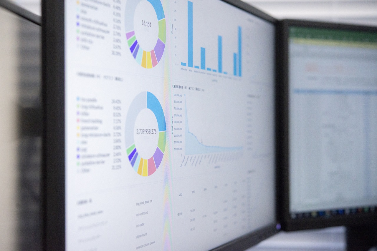
Ensure that visualizations are clear and easily interpretable. Opt for the right type of chart or graph for each data point—bar charts for comparisons, line charts for trends over time, pie charts for parts of a whole, and so on. Label axes, provide legends, and use tooltips to offer additional context where needed.
Accessibility is another key consideration. Adhere to web accessibility standards (such as WCAG) to ensure that your dashboard is usable by people with disabilities. For this, you must provide text alternatives for non-text content, ensure keyboard navigability, and design for screen readers.
Test your UI design with actual users to assemble feedback and define areas for further elevation. Conduct usability testing sessions where users carry out specific tasks leveraging the dashboard and observe their interactions to point out any usability challenges and obstacles.
Choose the Right Tools and Technology
The appropriate tools and technologies essentially impact the final product quality. Therefore, it’s necessary to evaluate dashboard software based on ease of use, features, and compatibility with existing systems. Implementing robust integration capabilities and scalability is a solid way to create a dashboard that meets current needs and adapts to future growth.
Dashboard Software
Choosing the right tools and technology directly correlates with the success of your dashboard project. Python is a robust programming language that offers its time-tested ecosystem, bringing in powerful solutions for developing sophisticated dashboards. For example, Dash by Plotly is ideal for creating interactive, analytical web applications with complex visualizations. Streamlit is perfect for rapid prototyping and user-friendly dashboards, requiring minimal web development knowledge. Bokeh provides interactive plots and real-time visualizations for large datasets. Additionally, Pandas and NumPy are essential for efficient data manipulation and analysis within the Python dashboard development process. Besides, Python is generally an excellent choice when it comes to integrating external sources into your dashboard software, as it delivers seamless and successful connections to key services in a prevalent number of cases. With these Python tools, you can build powerful, interactive, and visually appealing dashboards founded on your specific necessities.
Additionally, consider your team’s technical proficiency. Some elements of the mentioned tech stack require extensive coding knowledge, while others are more straightforward in use. Make sure that your selected IT vendor aligns with your team’s skill set to facilitate smooth development and maintenance. For instance, we at PLANEKS know how to develop a dashboard app with Python and can become your dedicated tech provider, designing your even more sophisticated software.
Integration Capabilities
The ability to integrate seamlessly with your existing systems is a core factor when choosing dashboard tools and technology. Your dashboard will need to extract data from various sources, so it’s essential to select software that supports robust integration capabilities. Check if the dashboard tool can connect to your databases, CRM systems, ERP systems, and other relevant data sources.
Make your software compatible with your organization’s IT infrastructure. Ensure it can operate within your network environment and meets your security and compliance requirements. Cloud-based dashboard solutions offer benefits like easy access and scalability. In case you would like to adopt cloud-powered software, you must evaluate its security protocols to ensure they meet your data protection standards.
Scalability is another important consideration. As your business grows, your dashboard will need to handle increasing amounts of data and users. Assure the chosen solution stack is suitable to create the platform that scales accordingly without compromising performance or user experience.
Develop and Implement the Dashboard
The implementation phase covers activities such as coding and configuring the dashboard to ensure accurate data representation and functionality.
Technical Development
With the design, data, and tools in place, the next step is to develop and implement the dashboard. Here, you bring your vision to life. Software engineers start by setting up the data connections established during the integration phase. The custom dashboard software is then connected to your data sources, ensuring that the data flows into the dashboard as required. Bespoke software is guaranteed to cater to your specific requirements; Within bespoke development, Python can be an excellent technology to build highly sophisticated, fully-fledged platforms that will deliver top-tier efficiency and performance. For those who want to create plain, simple products, Tableau may come as a suitable option, but for tailored and made-to-order dashboard software, it is better to use specialized, custom approaches.
Once the data connections are established, start creating the dashboard according to the wireframes and mockups. Create the necessary charts, graphs, and tables that will display your data. Pay close attention to the accuracy of the data being visualized, verifying that each element correctly represents the underlying data. Leverage the data transformation and calculation features of your dashboard tool to create calculated fields, aggregated metrics, and other necessary data manipulations. If you would like to implement solid technologies like Business Intelligence, you should get acquainted with the best practices for BI dashboard development.
Interactivity
As mentioned, interactivity is a key feature that can significantly enhance the usability and effectiveness of your dashboard. You may add interactive elements like filters, clickable charts, and drill-downs which allow users to explore the data more deeply and find the specific insights they need. Such elements directly enhance the experience, making your dashboard a powerful tool for data analysis and decision-making.
Adding filters that let users narrow down the specific data based on different criteria, for example, date ranges, geographical locations, or product categories. Filters should be intuitive and user-friendly, delivering clear options for users to select from. In practice, a sales dashboard might cover filters for different regions, sales teams, or time periods.
Drill-down capabilities allow users to click on a data point to see more detailed information. For instance, a high-level sales chart could allow users to click on a particular region to view sales data for individual stores within that region. This feature helps users move from a broad overview to more granular details without leaving the dashboard.
Incorporate other interactive features like tooltips, which provide additional context when users hover over a data point, and dynamic charts that update in real-time as users adjust filters. These elements make the dashboard more engaging and effective, facilitating deeper interaction and exploration.
Test and Validate
Quality Assurance testing and validation processes ensure that the final product is both functional and effective. This phase involves two key components: user testing and performance testing.
User Testing
User testing is essential to gather feedback from the end-users who will be interacting with the dashboard. This procedure helps you identify any usability failures or areas that may require enhancements. To do this, select a diverse group of users who represent the different roles and perspectives within your organization. Provide them with specific tasks to perform on the dashboard, such as filtering data, drilling down into details, and interpreting the visualizations.
As users navigate the dashboard, observe their interactions and take note of any difficulties they encounter. Collect both qualitative and quantitative reviews through surveys, opinions, and usage analytics. Query users about the interface’s intuitiveness, the data’s relevance, and the entire user experience.
Performance Testing
Performance testing ensures that the dashboard performs productively and efficiently under various conditions. This covers testing the dashboard’s load times, responsiveness, and stability with different data volumes and user loads. Performance assessments can be carried out by simulating typical usage scenarios to check how the dashboard operates during peak times and adopting tools to monitor performance metrics such as load times and memory usage. During performance testing, security aspects should also be considered. Verify that data is handled securely and that user permissions are accurately implemented to eliminate unauthorized access.
Check how quickly the dashboard loads and how it handles large datasets. If the dashboard is slow or unresponsive, investigate potential bottlenecks in the data processing or visualization layers. Optimize data queries and consider implementing caching mechanisms to boost performance. Aside from that, test the dashboard’s responsiveness on different devices and screen sizes to provide a consistent user experience across platforms.
Launch and Maintain
Rolling out your dashboard is the final step to making the app available to the primary users, ensuring its long-term success and relevance. This comprises deploying the dashboard to users and providing ongoing support and updates.
Deployment
The deployment marks the transition from development to active use. To prepare for this action, you should create a comprehensive rollout plan to ensure a smooth launch. This plan should cover user training, documentation, and a clear communication strategy. Effective guiding sessions help users understand how to navigate and employ the dashboard to its full potential. Provide detailed documentation that covers the dashboard’s features, functionalities, and troubleshooting measures.
Communicate the launch to all relevant stakeholders, describing the new dashboard’s benefits and projected impact. Handle any potential concerns and provide channels for users to seek help or report issues. During the initial rollout, closely monitor user interactions and gather feedback to identify any immediate issues that need addressing.
Ongoing Support and Updates
Once the dashboard is live, your aim is to keep it functional and relevant via ongoing support and updates. Establish a dedicated support team or helpdesk to assist users with any problems they face. This team should be well-versed in the dashboard’s functionalities and capable of providing quick resolutions to user queries.
Review user feedback to identify areas for improvement. Reliable strategies for this imply implementing new features, enhancing existing ones, or making adjustments based on changing business needs. Schedule regular updates to the dashboard to incorporate these enhancements. Ensure that updates are well-documented and communicated to users to minimize disruptions and keep everyone informed of the latest changes.
Besides, monitor the dashboard’s performance continuously, error rates, and user engagement metrics. Make use of these insights to address potential issues before they impact users. Don’t forget to update the underlying data sources and ensure that data accuracy is maintained.
Conclusion
Following these dashboard development stages ensures a robust, user-friendly, and impactful dashboard that goes hand in hand with you, assisting you in critical decision-making and catering to your organization’s needs.
Start your dashboard development process roadmap following these steps, and transform your data into actionable insights. Skyrocket and streamline your decision-making processes to drive your organization toward data-driven success. We at PLANEKS are dedicated to assisting you in the world of software development, so feel free to contact us and discover how we can take over your project with our full-scale dashboard development services.

