
Effective data visualization can be a game-changer for decision-making. According to the Aberdeen report, businesses using data visualization tools are 28% more likely to find timely information than those who rely solely on traditional methods. This insight emphasizes the critical role of visual data representation in clearly and efficiently demonstrating actionable insights. As for a CEO or startup owner, marketing director, or business analyst, a personalized dashboard can significantly enhance your ability to interpret and communicate data effectively.
This blog post will guide you on how to build a custom dashboard tailored to your business-specific needs.
Table of Contents:
Understanding the Basics
Before beginning the dashboard development process, you should familiarize yourself with the concept of such solutions and the existing dashboard software types. This will help you choose the dashboard suitable for your specific case and best cater to your business peculiarities.
What is a Dashboard?
A dashboard is a visual interface that assembles and displays key data points from various sources in a single view. It serves as a data visualization tool that optimizes complex datasets into easily digestible and actionable insights. Dashboards are designed to provide real-time tracking, data analysis, and reporting, making it seamless for users to comprehend and act on the data without having to sift through raw figures.
Types of Dashboards
There are three primary types of dashboards: operational, strategic, and analytical. In case you order custom dashboard development services, your credible tech vendor can assist you in choosing the right option, delivering maximum efficiency to your business.
-
- Operational dashboards are aimed to monitor day-to-day business activities and operations. They are perfectly suitable for monitoring metrics like sales performance, website traffic, and customer support tickets. These dashboards feature real-time data and detailed metrics, supporting operational managers and team leads stay on top of their immediate tasks and short-term goals.
- Strategic dashboards, on the other hand, cater to long-term goals and high-level metrics. They provide executive summaries and overviews of company performance, market trends, and key performance indicators (KPIs). Such dashboards are a go-to choice for executives and senior managers who need to keep an eye on strategic aims and organizational health over more extended periods.
- Analytical dashboards are created to research large volumes of data to uncover trends, patterns, and insights. They are used for tasks like data analysis, financial forecasting, and market research. Featuring advanced visualizations and interactive data representation, analytical dashboards can assist data analysts and business intelligence professionals who require in-depth data analysis and detailed exploration capabilities.
Benefits of Custom Dashboards
Custom dashboards’ flexibility and adaptability stand out as fundamental characteristics for any organization seeking to leverage data for strategic advantage.
Tailored to specific needs
Custom dashboards can be developed to meet specific requirements of different users or departments within the business. In contrast to one-size-fit solutions that are generic and deliver standard functionality, bespoke dashboards can integrate particular sources, datasets, and metrics that are most relevant to the organizational objectives and may not be presented in existing solutions. Therefore, the information displayed is directly aligned with the set goals, whether it’s monitoring project progress, tracking the efficiency of marketing campaigns, or analyzing financial flow within the company.
Enhanced Data Insight and Decision-Making
By introducing data in a visually coherent and interactive format, custom dashboards support users in extracting valuable conclusions, spotting trends, identifying anomalies, and coming up with meaningful insights. An immediate overview contributes to accelerated decision-making so organizations can respond faster to dynamics and catch arising opportunities. The ability to customize data views and filter information also means users can drill down into specifics, diving deeper into the underlying data.
Improved User Experience
Personalized dashboards elevate the user experience by providing intuitive and user-friendly interfaces. They eliminate the clutter of irrelevant data and present information in a well-structured, concise manner that is comprehensive and easy to interpret. Interactive elements, such as drill-down capabilities, real-time updates, and personalized settings, further elevate usability. Therefore, users can efficiently access and investigate the information they need without being frustrated by the search in excessive data loads.
Planning Your Dashboard
The data visualization customized dashboard development should start from carefully defined objectives, an understanding of your audience, and gathered requirements. This way, you set a solid foundation for creating a dashboard that is both effective and tailored to meeting its intended purpose.
Defining Objectives
Outline your dashboard software objectives clearly, identifying the specific goals you want to achieve. Think comprehensively, what are you seeking to track or overview? Are you looking to monitor real-time sales performance, track employees’ efficiency, or have the latest insights on your warehouse assets? This primary purpose will help you stay focused and ensure the dashboard meets its intended goals.
Based on clearly formed objectives, you can move on to determining the key metrics and Key Performance Indicators (KPIs) that will drive these goals. For instance, if your aim is to monitor sales performance, relevant metrics cover total sales revenue, number of units sold, and average transaction value. Set the appropriate KPIs to ensure that your dashboard will deliver valuable insights that align with your strategic objectives. The preparation step lays the base for selecting suitable data sources and visualizations.
Knowing Your Audience
Another critical aspect when planning your data visualization customized dashboard development is identifying your audience’s pain point and requirements. Identifying the target users helps you tailor the dashboard to their specific needs and preferences. Your users may be executives who require a high-level overview of business performance, data analysts who need detailed, granular data, or many other specialists operating in diverse departments. Each group has different requirements, and the dashboard should reflect that.
You also need to keep in mind your audience’s technical proficiency. A simple and intuitive interface with clear, easy-to-understand visuals is essential for users who are not very tech-savvy. They may need straightforward graphs and summary statistics that provide immediate insights without requiring deep analytical skills. Nevertheless, more experienced users might prefer advanced features like interactive charts, filters, and drill-down capabilities, allowing detailed data exploration. These nuances can also help you design a dashboard that is not only functional but also user-friendly and intuitive.
Gathering Requirements
Identifying necessary integrations and collecting data sources is a core phase in dashboard planning. You need to gather all relevant data from various sources such as databases, APIs, and external applications. It’s essential to ensure that the data you collect is accurate, timely, and relevant to your objectives. Identify which data points are necessary to track your KPIs and how they will be integrated into the dashboard. This might imply setting up data connections, automating data pulls, and providing data compatibility across different systems.
Next, plan the layout and design preferences when building a custom dashboard. Consider the best way to present your data to make it swiftly understandable and actionable. To do so, choose the right types of visualizations, such as bar charts, line graphs, or pie charts, based on the data your dashboard will be displaying. Besides, think over the overall design elements like color schemes, fonts, and layout structure to get a visually appealing dashboard that aligns with your organization’s branding. Effective layout planning also incorporates deciding on the placement of different components to facilitate a logical flow of information, helping users quickly find the insights they are looking for.
Master the Dashboard Development Process
Unlock the secrets of building effective dashboards with our step-by-step guide.
Choosing the Right Tools
The appropriate tools for data visualization and integration are vital for effectively managing and employing data, enhancing decision-making, and driving business success.
Data Visualization Technologies
Each tool has its specific strengths and limitations, and the choice depends on the individual requirements of your project as well as the skills of the team.
D3.js
D3.js (Data-Driven Documents) is a powerful JavaScript library that streamlines the creation of highly customizable and interactive data visualizations. It provides a flexible and comprehensive toolkit for binding data to a Document Object Model (DOM), enabling the implementation of dynamic, data-driven visual representations. D3’s flexibility and control make it perfect for bespoke and complex visualizations.
Pros
-
- High customization that allows for extensive customization and fine-tuning of visualizations;
- Scalability that ensures efficient handling of the large datasets and complex data relationships;
- Extensive documentation with in-depth guidance and assistance, as well as community support;
Cons
-
- Steep learning curve, the need for significant coding skills and knowledge of JavaScript;
- Performance-intensiveness for very large datasets.
- Overly complex for creating simple visualizations like bar charts, making it more suitable for sophisticated and customized visual representations
amCharts
amCharts is a commercial JavaScript library that provides a user-friendly interface for creating interactive charts and maps. It brings in enhanced intuitiveness, a wide range of pre-built charts, and boosted implementation, which comes in wide use for dashboards and business applications.
Pros
-
- Ease of use, intuitiveness, and user-friendliness, with minimal coding required;
- Rich feature set with a variety of chart types and customization options;
- Support, maintenance, and regular updates;
Cons
-
- Cost of licensing fees can be expensive, especially for large projects (You can freely use all amCharts products, with the only limitation being a small logo displayed on your charts though.);
- Limited flexibility and less customizable compared to D3.js for very specific visualization needs.
Highcharts
Highcharts is another popular JavaScript library for creating interactive charts and visualizations. It is widely adopted due to its simplicity and efficiency in generating dynamic charts, and it offers extensive compatibility with different platforms and browsers.
Pros
-
- User-friendly, simple API, and easy integration;
- Cross-platform, works seamlessly across different devices and browsers;
- Extensive examples and templates to get started quickly;
Cons
-
- License costs for commercial use;
- Customization limitations offer fewer customization options than D3.js.
You may also discover how to create a dashboard in Python, as it provides powerful frameworks like Flask and Django for building high-performance dashboard software. Besides, Python equips your tech team with solid libraries for data processing, such as Pandas and NumPy, to streamline data manipulation and analysis, helping create efficient backend functionality.
Data Integration and Management
Data integration provides a seamless combination of data from different sources, ensuring a unified view that is essential for accurate analysis, decision-making, and reporting. Proper data integration enhances data quality, enables real-time data access, and supports comprehensive data analysis, thereby driving operational efficiency and strategic insights.
Tools for Data Integration
How to make data visualization smooth and implement data integration successfully? You may find the solution in the following tools and approaches:
-
- ETL Processes (Extract, Transform, Load) are aimed at extracting data from various sources, transforming it into a suitable format, and loading it into a target database or data warehouse. This process guarantees that data is cleansed, validated, and structured for analysis.
- APIs (Application Programming Interfaces) ensure data integration by allowing different software systems to communicate and share data seamlessly. They facilitate the integration of real-time data and enable applications to access data from external services.
- Data warehouses are a centralized repository that stores integrated data from multiple sources. It is optimized for query and analysis and provides a platform for data reporting and business intelligence activities.
Designing Your Dashboard
Designing your dashboard relates to creating a user-friendly interface that effectively visualizes relevant data and metrics.
Best Practices for Dashboard Design
A concise and smooth design that is also easy to navigate can be achieved with the strategies listed below:
Keep it simple and intuitive
The primary goal of a dashboard is to present data in a clear and easily understandable manner. Simplicity ensures that users can quickly interpret information without being overwhelmed by unnecessary details. To create a streamlined and effective display, prioritize key metrics by showing only the most relevant and critical information. Limit the color palette to a minimal number of colors to avoid confusion and ensure focus. Besides, consistent layouts are used to maintain a uniform structure across different sections, enhancing usability.
Focus on clarity and readability
Clarity and readability should be your priority when it comes to creating data visualizations. Data should be presented in a way that facilitates quick comprehension and decision-making. For this, ensure all charts, graphs, and data points have clear labels, descriptive titles, and legends. Use readable fonts that are easy to see across different screen sizes, avoiding ornate typefaces. The optimal way to organize information is to guide the user’s eye logically from top-left to bottom-right.
Use appropriate charts and graphs
Successfully conveying your data story with the relevant data chart types. Use bar charts for comparisons, line charts for trends over time, pie charts for proportions, and scatter plots for relationships between variables. To ensure clarity, avoid overcomplicating your charts by overloading them with too much data; keep them simple and focused on one or two key insights. Whenever possible, incorporate interactive elements like filters or drill-downs. This helps users to explore the data more deeply without cluttering the initial view.
Wireframing and Prototyping
Wireframing and prototyping help ensure the final product meets user needs and expectations while supporting intuitiveness, effectiveness, and clarity. Several solid tools are available for each of these design process stages and project types.
Wireframing is a crucial step in the dashboard design process as it allows designers and stakeholders to visualize the layout and functionality of the dashboard before development begins. This preliminary step helps in:
-
- Clarifying structure. Provides a clear blueprint of the dashboard’s layout, showing where each element will be placed.
- Identifying issues early. Highlights potential usability issues or gaps in data presentation, enabling early correction.
- Facilitating collaboration. Serves as a visual aid for discussions with stakeholders, helping to align expectations and gather feedback.
Tools for Wireframing
Various tools are available to streamline the wireframing process, suited to different needs.
Figma
Figma is a powerful cloud-based design tool that facilitates real-time collaboration, allowing team members to work together seamlessly from anywhere. It provides an all-around kit of design features and makes sharing and iterating on designs straightforward, which helps remote teams and projects requiring constant collaboration.
Sketch
Sketch is a powerful vector design tool that introduces features tailored for UI/UX designers. It powers detailed design work and integrates seamlessly with various design and development workflows, especially for those working within a macOS environment.
Balsamiq
Balsamiq offers rapid wireframing with its user-friendly interface and low-fidelity design approach, which promotes quick iterations and feedback. It is used for early-stage wireframing, where creating quick, low-fidelity prototypes is integral for testing ideas and extracting feedback efficiently.
Turn Data into Actionable Insights
Partner with us to build a custom dashboard that empowers your business to make data-driven decisions.
Building the Dashboard
With the following strategies and approaches, you can implement a functional, user-friendly dashboard that effectively communicates key insights and supports data-driven decision-making.
Data Preparation
Cleaning and organizing data is a critical first step in building an effective dashboard. Proper data cleaning and organization ensure that the information displayed is accurate, relevant, and easy to interpret.
Effective data cleaning covers identifying and handling missing values by filling them in or excluding them, removing duplicates to ensure data integrity, and correcting inconsistencies by standardizing formats and fixing errors. For data organization, structure the data logically to align with analysis goals, categorize data meaningfully, and create derived metrics such as year-over-year growth to enhance analytical insights.
Accurate and consistent data directly impacts the reliability of your dashboard. Regular validation checks ensure data integrity, while applying consistent rules for data entry and maintenance helps avoid discrepancies. Automate data updates to keep data current and accurate.
Implementing the Design
Let’s go through the gradual dashboard design implementation steps.
Step-by-Step Guide to Creating the Dashboard
To build a custom dashboard, start defining your specific requirements and choosing an appropriate technology stack tailored to your project’s needs. Next, implement the code to connect to your data sources, such as databases or APIs, ensuring you retrieve the data efficiently. Clean and structure the data according to your particular specifications to make it maximum useful and efficient.
When designing the layout, begin with a wireframe that outlines where each element will be placed. Arrange key metrics and charts in a logical flow that emphasizes crucial insights and facilitates easy understanding.
Choose Chart Types:
Here are some of the most popular chart types you may implement into your dashboard:
-
- Bar charts are the best fit for comparing different categories or tracking changes over time;
- Line graphs are great for showing trends over time, making them suitable for continuous data like monthly sales figures;
- Pie charts are useful for illustrating proportions and parts of a whole;
- Gantt charts are ideal for project management, showing timelines, and tracking project progress;
- Calendar is a solid option for displaying data over dates, such as daily sales or events.
- Table is suitable for detailed data and exact figures.
Remember to incorporate interactivity within your dashboard. Consider adding filters, drop-down menus, or drill-down options to ensure users are engaged and can easily interact with the data. Still, make sure that interactive elements enhance rather than complicate the user experience.
Finalize the design by working on its visual appeal and usability. Each element should align with the initially-set objectives accurately. It’s also essential to stick to consistent colors throughout and use legible fonts across the dashboard.
Tips for Effective Data Binding and Visualization:
-
- Contextual Relevance: Bind data to visual elements that best represent the underlying information. For example, use line graphs for trends and bar charts for comparisons.
- Maintain Simplicity: Avoid cluttering visualizations with excessive data points. Focus on key metrics and clear visuals.
- Dynamic Data Updates: Set up data bindings to update visualizations automatically as new data comes in, ensuring the dashboard remains up-to-date.
- Test Usability: Test the dashboard with potential users to gather feedback and make necessary adjustments for better usability and insights.
Testing and Deployment
Test your dashboard software prior to its deployment.
User feedback is crucial for refining the dashboard’s effectiveness and functionality. Methods such as interviews, surveys, and usability testing sessions may come in handy for you to provide valuable insights into user preferences and pain points.
Iterative improvements may also be useful to focus on addressing user feedback as soon as possible. Common pitfalls cover overloading with unnecessary features and neglecting user experience principles. Regular testing and prioritizing user needs help avoid these pitfalls.
As for the deployment strategies, you should choose between on-premises and cloud hosting based on scalability and security needs. Some credible options prevailing on the market are Amazon Web Services (AWS), Microsoft Azure, and Google Cloud Platform. Moreover, data security should be put first and profoundly safeguarded via encryption and access controls while optimizing performance with scalable cloud infrastructure (in case you go for the cloud-powered hosting option).
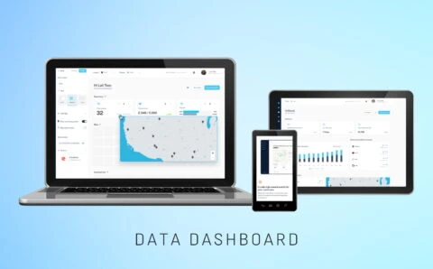
Spontivly
Our cooperation with Spontivly enabled seamless data integration, delivering faster workflows and crucial insights to 70+ companies, enhancing success.
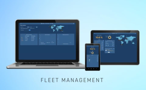
Spark
Spark simplifies fuel data into actionable insights, improving fleet energy efficiency with real-time tracking of fuel consumption and emissions.
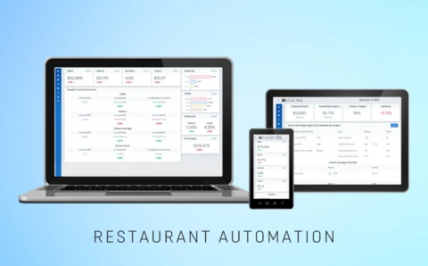
Restaurant Management
Created a management tool for restaurants that automates tasks, integrates data from various systems, enhances profitability with accurate KPIs.
Maintaining and Updating the Dashboard
Keeping data and visualizations up-to-date guarantees the dashboard remains relevant and reliable. Implement strategies like automated data refreshes and regular checks for accuracy.
Besides, you should advance your software with new functionalities based on user reviews and business objectives. You may also implement technologies like Machine Learning (ML), and Predictive Analytics to make your software even more sophisticated. Seamlessly integrate new data sources and visualizations while prioritizing scalability and flexibility. Ensure compatibility with existing infrastructure and adopt modular design principles for easy expansion and adaptation to evolving needs.
Conclusion
| Phase | Illustration of the phase | Duration | Estimated cost range |
| Discovery & planning | Requirement gathering, scope definition, initial planning | 1-2 weeks | $1,000 – $3,000 |
| Design | UI/UX design, wireframing, mockups | 2-4 weeks | $2,000 – $5,000 |
| Development | Frontend & backend development, database integration | 4-12 weeks | $5,000 – $20,000 |
| Testing & QA | Bug fixing, usability testing, performance optimization | 1-2 weeks | $1,000 – $3,000 |
| Deployment & launch | Server setup, deployment to production environment | <1 week | <$1,500 |
| Post-launch support | Maintenance, updates, user support | Ongoing | $100 – $1,000 per month |
This post has described how to create data visualization software effectively. Considering everything, customization plays an integral part in making data representations specifically designed for your specific requirements. The bespoke dashboard can become your integral assistant in data-driven decision-making by providing actionable insights at a glance, enhancing efficiency, well-thought-out strategies, and informed choices.
Contact PLANEKS representatives and let us become your trusted IT vendor. We’ll consult you on how your business can benefit from custom data visualization solutions tailored to your specific needs and data sources. Our dedicated team of tech professionals can take your data perception to the next stage with our custom dashboard development services. With PLANEKS, you can skyrocket your decision-making process with a dashboard that delivers clarity and strategic advantage in every aspect of your business.

